In order to increase your reach, keeping accessibility in mind is a good idea.
Accessibility is a way to offer people with a disability access to your website. There are mainly two to consider in this area:
- Blind People
- Deaf People
There are other disabilities that also affect the content on a website, but they are generally less likely to impact your specific Niche Website.
For example, some people are epileptic. A website with videos that have very fast changing images, think of a flashing strobe light effect in a nightclub, can affect an epileptic person by inducing a crisis. Accessibility, in this case, means that the video includes warnings, in text around the video, in text and audio at the beginning of the video, in the closed caption of the video, anywhere else you can think of, that the video is not appropriate for epileptic people. This applies to anything that is going to flash, blink, or move on your web pages.
If you are not affected by such handicap, it may feel like a lot of extra work for nearly nothing. However, Google and other search engines make use of the extra data needed on your website to make it Section 508 Compliant. The World Wide Web Consortium (W3C) actually says:
“Case studies show that accessible websites have better search results, reduced maintenance costs, and increased audience reach, among other benefits”.
Although the upfront cost is higher, the benefits are great. Anything you can implement on this list should be done so as to increase your long-term reach.
What is Section 508?
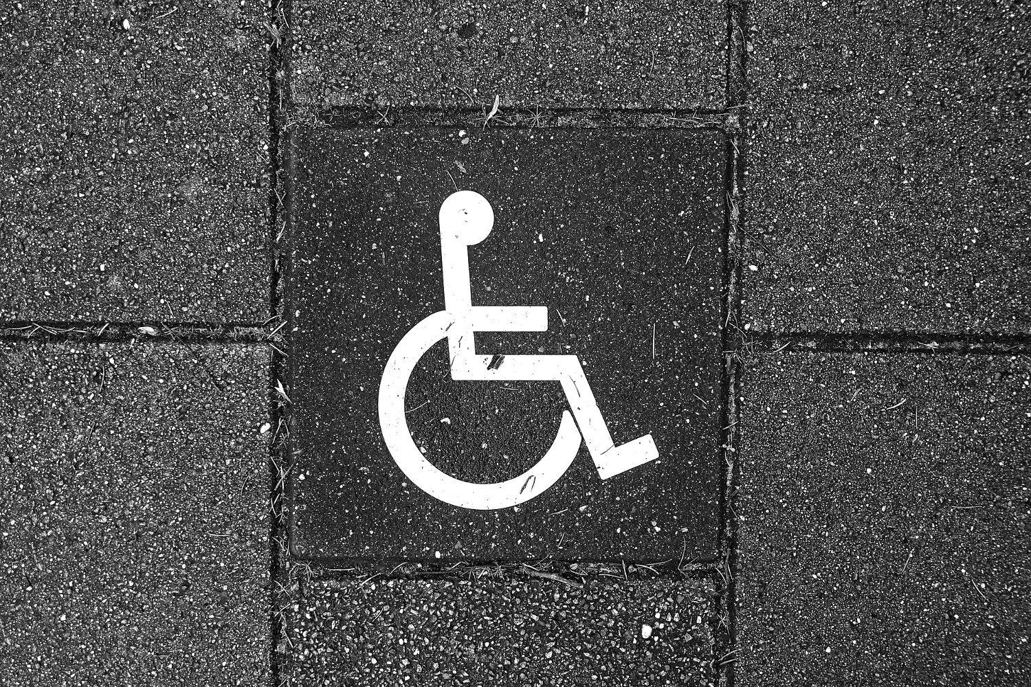
This refers to a large section of the United States Federal Law. Section 508 is about adapting your business to all handicapped people who are expected to have access to your products or services.
Certain parts of the section are considered mandatory if you are a US business. For example, physical accessibility to people in a wheelchair is simply required for all brick and mortar businesses. If I can’t get inside your store just using my wheelchair on my own, you are guilty of discrimination.
There have been many court cases about that in the US and more and more in other Western Countries. Some of which cost millions of dollars to various companies. In some cases, it cost the business so much that they had to shut down.
On the Internet, you have similar rules. At this point, though, only governmental agencies and certain large companies are forced to abide by Section 508. Most of us do not have to do anything about it, yet following the basic rules is a plus for your On-Page Search Engine Optimization (SEO).
Work Overlap Supporting Mobile Devices
Note that when you create a website theme that works on Desktops and Mobile Devices (specifically smartphones & tablets), you actually are likely to implement some of the features required by Section 508. For example, I talk about font size and large buttons below. Both are part of implementing a website which is functional on a smartphone.
Accessibility of Visual Media (Images)
If you’ve been around even for a small amount of time, you probably heard of this one and it’s actually part of Section 508:
Include an alt="..." attribute¹ to all your images. With WordPress, this means writing something in the Alt Text field whenever you use the “Add Media” button to add an image to one of your web pages.
The Description can be used too. The difference between the two is that the description is going to be long and very descriptive, possibly explain more than just what’s visible in the picture. The Alt Text describes the image itself. You should not use the Description if the image doesn’t warrant it. You may also use the Caption instead. The Caption is visible to everyone, however, it takes some space on your visible web page.
Note that in some part of the world, bandwidth costs money so some people browse the Internet with the “don’t load images by default” feature of browsers turned on. This may sound crazy to some people, but it actually makes a lot of sense. Having the Alt Text on your image will also help these people with taking the decision of loading or not loading an image on a web page.
Blind people make use of browsers that give them the ability to listen to that content being read to them. By default, the Description remains hidden for us. Depending on the browser, the Alt Text may appear when you hover your mouse over the image. To see that information, though, you can right click on your mouse and select View Properties or Inspect Element…. This is the only way I know of which is reliable and will for sure show you the final result.

WordPress also gives you the ability to enter a title. For that one, I use the title of the file which I fix before I upload the image to my WordPress website. So say your camera generates images with a filename such as DSC1234412.jpg, do NOT load that image as is on your WordPress website. Instead, edit the filename to something such as me-on-my-motorbike-around-lake-tahoe.jpg. You could also add a date, although I think that evergreen content does not require a date (plus WordPress will upload the image and date it anyway—look at the final path.)
See also the section about Color Blind people.
¹Note that some people call the alt="..." attribute a tag. It’s not technically a tag. It’s an attribute which is part of the <img ...> tag.
Do I need to add all of that information on every single image?
Generally, no. That is, any image that you use as decoration (which should probably be part of your theme CSS) doesn’t need to be described in this way at all. Blind people do not care about your theme. Actually, a plain text website (very basic HTML) would work just fine for them. So any decorative images can be marked as such or not marked at all. Modern readers ignore those altogether.
Could I use a Long Description?
Yes. However, note that the longdesc attribute was deprecated in HTML5.
You may always add a link around or even on the image to a page with a long description of that specific image. That should of course only be done with images that are to benefit from such long descriptions. Also, remember that a page should have a bare minimum of 450 words, but preferably at least 1,500. That’s a quite long description indeed!
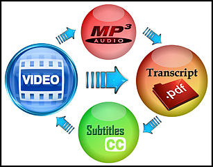
Audio Transcripts
For those of you who propose audio files on your website (i.e. maybe you have a podcast?), you want to include the entire transcript of each one of your audio files.
This is not only good for people who are deaf or have difficulty listening to audio files, but for Google and other search engines. This is actually content for you. Really good fat content (i.e. I would imagine that your podcast is likely to be over 2,000 words without much of a problem.)
If you don’t find yourself incline in transcribing your audio files to text, there are services that can do it on the cheap. You should re-read the content once to verify that it’s correct, but that should get you going a lot faster than having to transcribe the whole file by hand. I know, I do it once in a while for my videos. It’s not as easy as it sounds! (no joke!)
Although there are tools out there that are expected to transform your voice into words, these work just comme-ci comme-ça… If you speak distinctively enough, these may work for you, but I know that in my case I most often have to redo it completely after such an attempt. That being said, Facebook and YouTube both seem to have a really good algorithm for such because their default subtitles are often very close to being correct.
Video Transcripts
Just like for your audio files, you want to have transcripts of your videos.
A really good example of this method is visible on the Whiteboard Friday by Moz. Not only are these long videos useful for SEO, Moz includes the entire transcript and the pictures in their post (it’s part of their blog.)
The result is that not only blind and deaf people can learn of the video contents, but so can Google and all the other search engines. Therefore, this will definitely increase your SEO ranking for that one piece of content.
Video Sub-titles
Very similar to having a transcript, all your videos should include Sub-Titles (also called Closed Captions.)
Although it may be possible to include your transcript for the closed caption, remember that it has to be timed along the audio of the video to be useful. This will take you a little more time than just saying “here is the transcript”! However, YouTube is really good at finding the right location for your text. I have not tried to upload a large text file for a video, though.
If you get a PDF for one of your Audio or Video, you can also offer it for download. After all, if someone has such a document, a free e-book, in effect, you can have many links back to your website inside that document possibly making it very useful for you to get additional return traffic.
Full Video Closed Captions
You may have seen movies where you see a closed caption that says “[car siren beeping]”. This is what I call “Full” Closed Caption. I call it that way to distinguish it from a more regular closed caption that only includes the dialog.
If you find the time, having a Full Video Closed Caption describing the scene in much more detail than just “Dude A says: Blah, Dude B says: Foo”, it will make things more enjoyable for your deaf and blind listeners. This is like listening to a book instead of just a dialog. If your videos are pretty much like a broadcast without much visual to describe, then the Full Video Closed Caption won’t help much here (i.e. if you just talk about a subject, letting the audience know you are wearing a red sweater and purple socks is probably not necessary even if these elements are visible on the video screen.)
To better see the various elements on your web page, you need enough contrast between each one of them. If you use a light gray for your text over an off-white background, chances are a lot of people are not going to be able to read said text.
The best contrast is pure black over pure white or vice versa.
Note that there are other problems with mixing color. Writing in red is likely to be unreadable by many, especially older people. If it’s just a word such as a WARNING, it probably won’t hurt. If you write an entire paragraph in red… that’s a different story. It will probably be skipped in its entirety by many.
Also, make sure to have a white light when you test your website. Although some people do use their computer in a dark room, that’s hardly the majority. Most websites are actually using black text over white. There must be a good reason for that!
Font Size
People who are getting older generally have a harder time to see. This means creating a website with a very small font is going to make it difficult for them to read your website (especially on a smartphone device where it may become like a bunch of ants walking on your screen.)
Smartphones often allow you to resize the screen (although make sure your website theme does not prevent such. Some site prevent you to zoom in and if you can’t read anything in them… that’s rather terrible to have such a feature turned on.)
Many US federal and state government websites include a way to increase or decrease the size of the font with buttons such as A+ and A-. If well done, it should stick around and not require a reload, but of data which is now visible and was not yet loaded.
If your website caters to older people (i.e. a retirement home), then you may also want to explain how to enlarge your pages on various devices. For example, in my browser I can use Ctrl-+ (Type Plus (+) while holding the Control Key down) to make things larger and then Ctlr+- (Type Minus (-) while holding the Control Key down.)
You may also want to offer information such as the Zoom or Lens support of the OS for that person. or example, under Linux I can use Alt-Ctrl-N to enlarge my entire screen and Alt-Ctrl-M to get out of it. Microsoft Windows comes with a Lens capability.
Large Buttons
Just like with large fonts, large buttons are useful for people who have difficulty to see or aim at small items (shaking hands, generally not well coordinated.)
If you have a smartphone version, you will likely have large buttons. These can be made available to Desktop users as well! That way you have one theme that works well on both types of platforms and allows more people to navigate with more ease.
Print Page
Some people have a hard time reading on a monitor, but can perfectly read on paper. For me, that’s rather the opposite, but you just can’t assume anything when it comes to accessibility.
Offering the users a way to print your pages is a good idea, especially if the print version is going to be a more text like version (i.e. without all the bells and whistles of your beautiful themes.) The point here is to offer the important content of the page and not the pictures, navigation, etc. which are not going to be useful to your users who print one of your pages.
For you, printing my page here could be useful to then mark each point as taken cared of on your website.
One word of caution: Make sure that the feature does not create another page with a copy of your content or you are not unlikely going to be hit by the Google Duplicated Content Detection ability. This would probably be a lot worse for your website than not having a text-only Printing feature. If a text page appears, make sure it is marked as NOINDEX and has a canonical that sends people to the main HTML page with your theme and navigation.
Note that now a day most browsers are capable of doing the work of removing all the graphics automatically so you likely don’t have to do anything in this arena. If your theme is simple enough, your users should be able to print with no concern.
Easy Keyboard Access
Accessibility for the blinds means that everything on your website is accessible through the keyboard.
Some of these features include the ability to navigate through your menu without having to hover the mouse over a specific area to then see a popup with the actual menu items. How you get that to work is your own business, but I can tell you that it should be as simple as possible to avoid having to click 2 or 3 times just to enter/exit a sub-menu.
A good feature for your menu, especially if it is rather long (i.e. more than 5 items), is to have a first link named “Skip Navigation Menu”. This gives the blind person a way to go to your content directly. Particularly useful if the person wants to visit multiple pages and not re-read the navigation menu each time.
Note that any long list that you may be offering should not force your users to go through the entire list to go past it.
The keyboard access needs to include all areas. This is where IFRAMEs can be problematic. Keyboard navigation between IFRAME elements adds a layer of complexity. Not only that, once you are inside the IFRAME, it’s often difficult to properly get your focus back out of that IFRAME. Be careful and mindful of your theme design! Remember that Ads will generally use IFRAMEs.
Note that easy keyboard access is particularly important if you include forms on your website. All forms should easily be accessed. For example, label tags should include the for=”…” attribute referencing the corresponding field and instructions on how to fill out the form should appear before the form, not after (in terms of navigation, after is problematic for people with disabilities.)
Voice Controlled Navigation
More and more, handicapped people are given access to devices that can convert their voice in various computer commands. There are ways to allow much faster navigation of your website if your links are properly tagged for voice controlled browsers (here tagged means that you have specific attributes in your navigation tags).
I have not yet worked on such so I’m afraid that at the moment I can’t help much in this area. As I learn more about this feature, I will update this section.
The Color Blind
Another common mistake is to only make use of colors to distinguish between various items. People who are color blind can’t distinguish certain colors. Most often it is in the Red area, but I’ve met people who are color blind in the green and blue as well.
The shape or text should also be used to make sure that everyone can actually determine what they are expected to do on your website to move forward.
There is a probably bad example of what someone who can’t see the color red would see when looking at the image on the left. Instead, they would see a greenish/grayish image as on the right.
 |  |
Note that many actually see things more in grayscale rather than modified color. Also, color blindness has various levels. You may be able to see 50% of the red, for example, for others, the colors may get mixed… some people say they actually see life in pink: La Vie en Rose! (Note that I say that casually and although it may sound great to see La Vie en Rose, I don’t think color blind people find it that great.)
A Separate Section for Disabled
Some people create websites where disabled people can navigate a more raw version of the site. This section would have fewer navigation links and possibly some other different features allowing for easier use of the website by blind and deaf people.
If you have a CMS that allows for such a separate section to automatically be generated, then it certainly is a good idea to have such. However, I have no clue how you can handle the part of “Content is Duplicated” problem. What I would suggest, something I do with some other websites, is a way to “tweak the theme”. I have such a feature in my Snap! C++ (which as a whole is not yet ready for prime time, but well… soon, I hope!) software which allows me to use a query string as in:
https://www.example.com/?theme=notheme
In effect, this gives me a very simple black and white theme which just displays the menu and the content of the page. The path to the page is exactly the same, only the query string changes. This may be easier to handle with Google and SEO than having a completely separate web page to support a plain theme.
Are we all disabled?
This may sound like a strange question, doesn’t it? I talked about people who are, as we say in the US, legally disabled (they have been recognized by the state as disabled.) The fact is many of us create websites blindly and certain things we put on our pages end up being invisible to some of our visitors. This is because we are not all born equal.
I won’t lie to you, this is something rather difficult to manage on your own. However, a good designer will add a certain amount of psychology knowledge to his design. Here is a video talking about such. As an Internet Affiliate with a Niche Website, it is not the first thing you want to have to deal with. But further down the road, once you start making good money, it is a way to yet increase your conversions even more. At some point, I will write a post just about that and add a link here.